Motivation
— Latour, 1993
The quick adoption and expansion of networked objects and infrastructures enacts new layers of agency in the cities. These new actors are ever growing in pervasiveness, rapidly learning from their surroundings and establishing connections with other devices. The traces of their interactions with humans can be recalled.
As young researchers in the realms of Urban Planning and Information Technology, we are confronted by vast amounts of unrelated data being generated, consciously or unconsciously, by users of digital services, public administrators and private enterprises.
Data is the primal matter of this modern craft. Today, this matter is massive and delicate: it is endowed with a deep sense of humanity, since it holds disconnected portions of our DNA as a species. We believe our work should serve directly the societal implications that are drawn from the management, ownership and usage of these data. We hold the hopeful view that, once the risks and pitfalls of this technology have been acknowledged and acted upon, they may well provide us with a wonderful channel to understand our kind.
We have dedicated our free time to recall some of these traces, in the hope that by doing so we foster the awareness of the multilayered character of contemporary urban dwelling, of ourselves, of others, and of our digital footprint -in this study case, quite literally.
Being able to access our public data is to us as important as being able to access our public assets: Data as a public asset. This project draws from this conviction and from our personal interest in mapping complex relationships, transforming seemingly meaningless rows of 0s and 1s into visual, descriptive maps. And most importantly, it draws from our unconditional love for this city: De Madrid al cielo.
Who are we?

Fabio Galicia
Fabio is an Architect and Data Scientist, interested in unveiling the intricate relationships that make up cities.

Javi Ramirez
Javi is a Computer/Data Scientist and Designer, with a passion for mixing engineering with art to create cool things.
We met each other by chance, searching for some transport data on GitHub, and it was love at first sight. We share a common interest on complex data sets, powerful visualizations, visual aesthetics, and challenge. This project is a testbed of all that.
Introduction
— Bell & Dourish, 2006
In the current hot discussion of present and future urban mobility, public access to bikes and other lightweight means of transport are triggering novel ways of navigating cities, stretching the cognitive processes by which we experience and understand our built environment.
Differently from other European metropoles, cycling in Madrid has suffered from a late mass-adoption. Madrid lacked a sensitivity towards the bicycle, due not only to certain cultural constructs but also to an apparent inadequacy of its built environment to afford this kind of transportation: steep topography, narrow streets in the city centre or fast drivers on main roads, among others.
The implementation of BiciMad service in Madrid, as well as the new green corridors (Madrid Río, Anillo Ciclista) and the necessary revision of traffic-flow control to allow for preferential bike landings at traffic lights or slower lanes for cyclists have already altered the city’s classical mobility patterns.
The project strives to analyze Bicimad’s mobility data in relation to the city’s built environment. We present a few insights that arose from the observation of the results. The following sections deal with the data sources, the methodology followed to flex the data, a brief discussion on some of the results and proposals for further work.
Methodology
Infrastructure and Data Sources
All the data used for this project is open and publicly available:
- EMT Madrid Open Data: opendata.emtmadrid.es
- Madrid Open Data: datos.madrid.es
Our stack of FOSS4G for geospatial data processing consisted on:
- PostGRES + PostGIS
- Pgrouting
- Python
- Processing
- QGIS
Data formatting
Bicimad’s dataset came in a JSON format. Our set contained also some formatting errors, so the first thing to do was to identify those and clean the file, turning it into something we could work with. The next task consisted on evaluating the data: From the original dataset, containing 200K+ entries, only ~80K contained geographical information. We created a subset out of those, and culled out irrelevant fields (list of street names for instance), formatting the result into a GeoJSON file with a Multipoint2D geometry type.
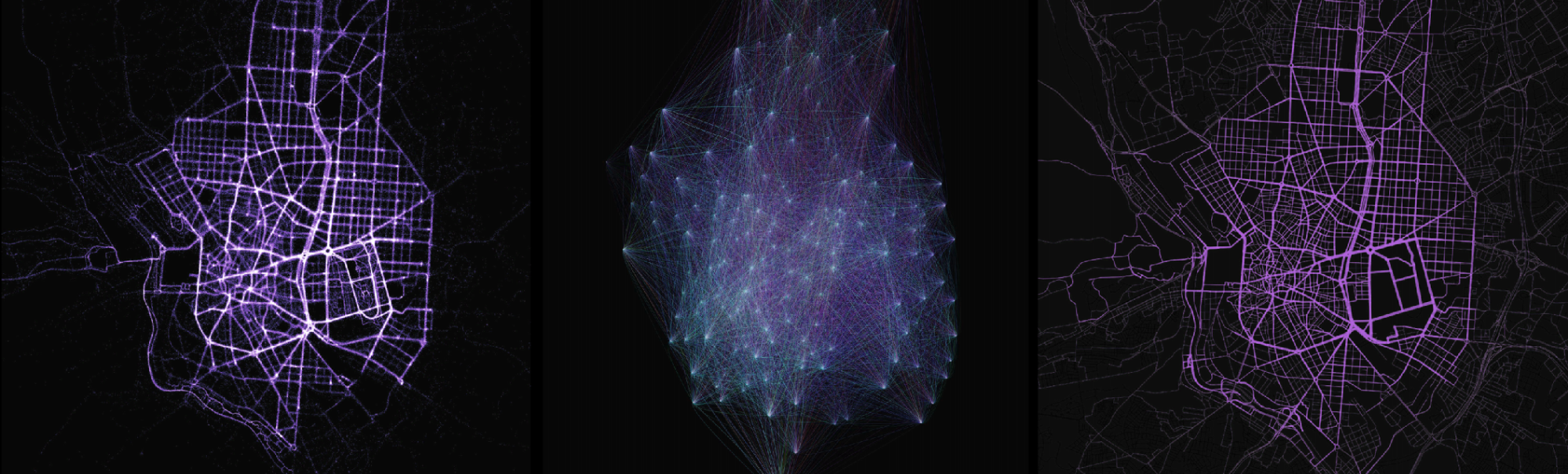
The first go at visualizing the data was bittersweet: a very dense point cloud with no relationship whatsoever with the city itself.
Data enriching
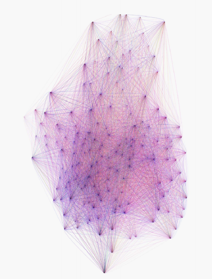
The first real data processing tasks were aimed to get a high level understanding of the material. We extracted a set of A➡B trips with their frequencies, and aggregated some of the fields like the velocity. We created a visualization using bezier arcs coloured by mean speed, in an effort to convey direction: origin and destiny (they did have very different speeds!), rather than the typical all-to-all straight-line diagram.
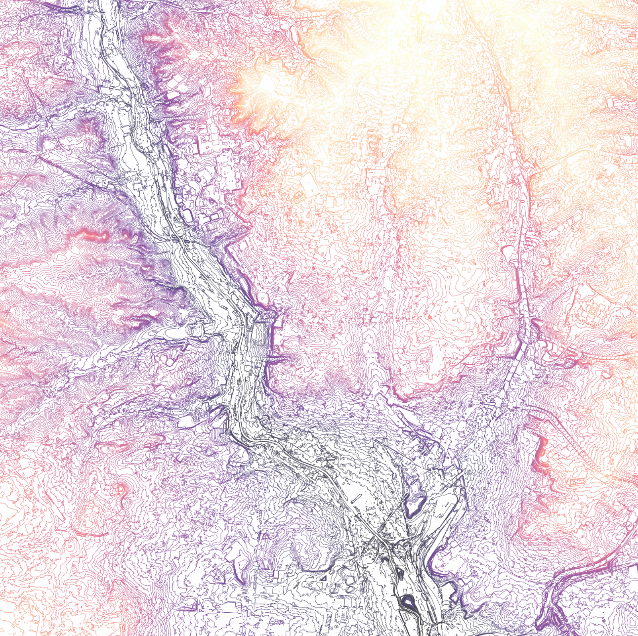
This was nice, but given the volume of trips, it was hard to extract any conclusions. So we tried to establish a relationship between our GPS tracks and the streets’ network. We had a centerline layer with Z values. We had GPS points. So our intuition for a quick analysis was to measure the divergence between shortest paths and the actual routes.
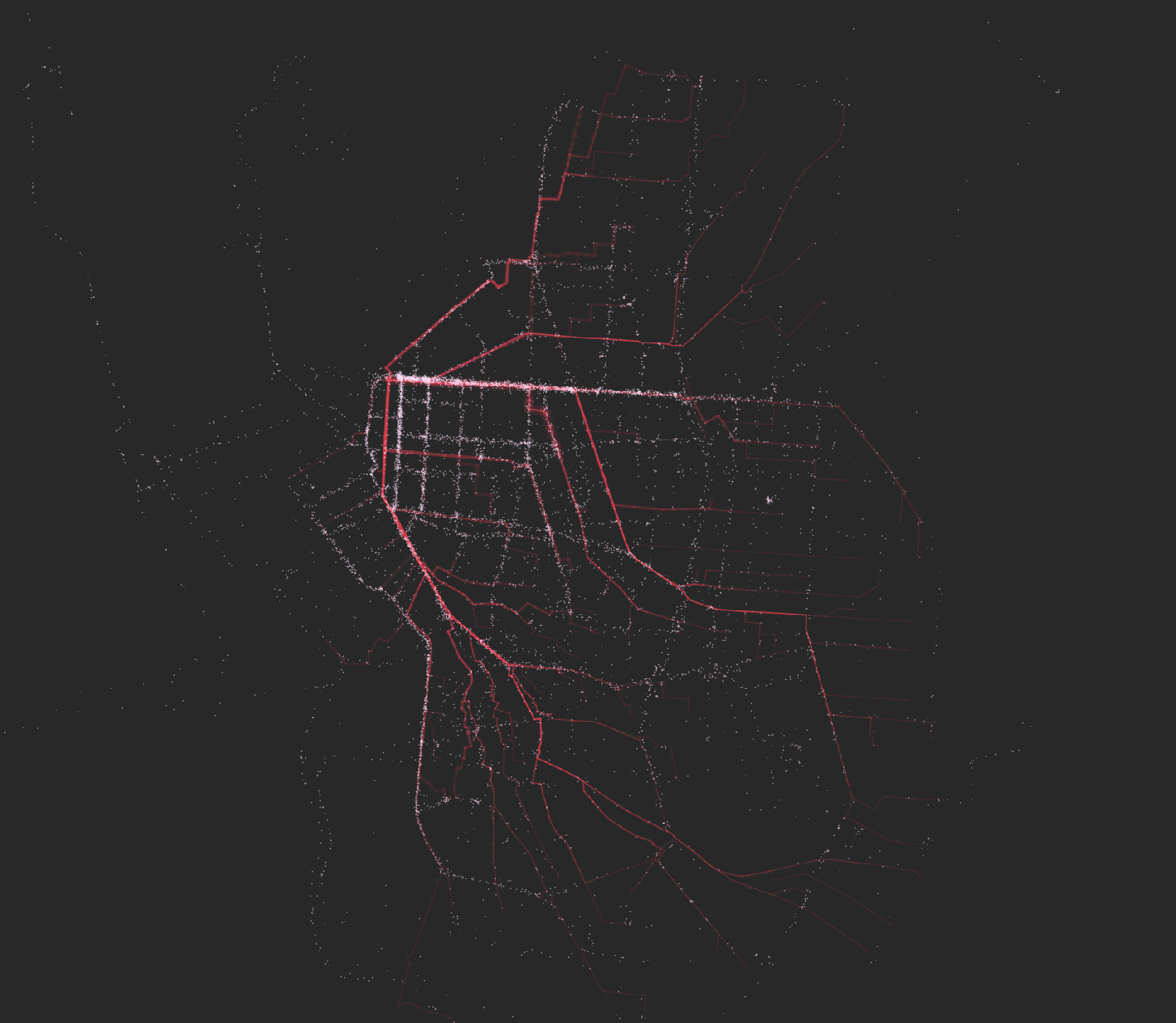
We used Dijkstra's algorithms and aggregated frequencies of tracks per segment, obtaining a set of line diagrams that recalled electrical circuits, rather than more organic movement paths. Overlaying the actual set of GPS coordinates, we obtained some interesting visual relationships - and, as expected, a lot of divergence:
So the only way out was to actually attach every single GPS point to the network and implement a sequential routing algorithm. This proved to be quite problematic: the tracks contained a lot of noise, coming from clusters of points at specific locations, mainly origin and destiny (plugging and unplugging the bike) but also during the trip (traffic lights, stops, etc.). This noise had to be reduced via a location-based grid snapping algorithm. The clean subset of points was then reordered.
At this stage, we were ready for the sequential routing, mainly stitching the points together to the network in an attempt to extract more valuable information like aggregates. The algorithm worked in conjunction with several calls to a KNN algorithm and returned clean, real tracks onto the roads’ centerline reference system. Moreover, this network was 3D and the GPS tracks had been attached this information via the topography layer, so the resulting tracks also contained an elevation array.
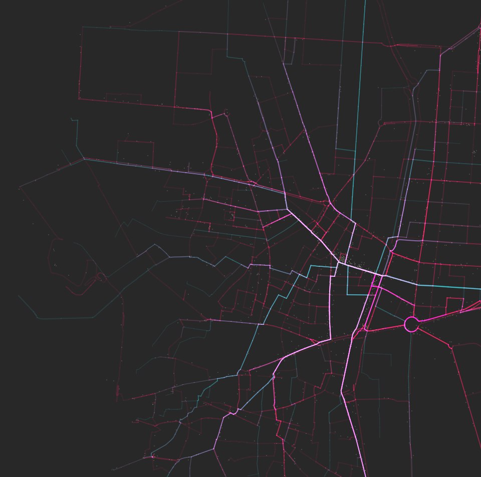
For the sake of testing, we overlaid both methods and observed the actual divergence with the same geometry format - blue are A➡B shortest, red are real trips, white are convergent segments:
Voilà! We had arrived at real tracks, mapped onto the network, so we were ready to explore the depth of the data and extract some conclusions.
Data exploration
As a proof of concept, we decided to categorize the tracks into different user profiles. Then observe the differences across users in an attempt to discover different behavioural patterns. As can be seen in their individual maps, each profile uses the network differently. For every one, we extracted some high level statistics and their traces’ map. Then we tried to mix the quantitative and visual information to describe each behaviour. Please visit each profile’s site for more information.
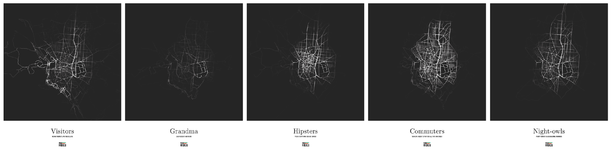
The new dataset proved to be very rich. In conjunction with other layers, we identified curious relationships, like access to bars and station loads; directional daily trends on loading and unloading of stations, high level demographic access to stations, relationship with green areas and natural corridors, aggregated speeds on the network, etc.
This project presents only a few clear, direct ideas to make the viewer aware of how other users use the very same service in their city.
Further non-spatial data exploration of the set can be found in GitHub: https://github.com/rameerez/bicimad-data-analysis/blob/master/bicimad-rides-data-analysis.ipynb.
Interactive data visualization
With this information and clean dataset, we decided to go on and make an interactive data visualization tool so anyone could freely explore the data and find new patterns in it. That would be the website you’re visiting right now, you can find the interactive data visualization tool here.
To make it, we needed to set up and code the server side (an API to query and get filtered GeoJSON data from) and the client side (the Javascript application that ultimately renders and lets you interact with the data).
We used the following technology stack:
- Postgres + PostGIS as the database server
- Ruby on Rails 5 to make the API
- Heroku as an easily scalable infrastructure provider
- HTML5 + CSS3 + JS (ECMAScript 6) as basic frontend tools
- jQuery to help handle DOM elements
- Leaflet as the map provider
- D3.js to render the GeoJSON tracks as SVG paths on top of a map
The basic functioning of the web app is easy: the frontend sends GET requests to the API with the user-desired parameters to filter the data (type of user, density of tracks, user age, etc.), the backend server then receives the request and Rails queries the database with the desired parameters and returns the information as a valid GeoJSON for the frontend to process and paint.
Further work
Further work might be able to shed some light on many different topics:
- Can the inclusion of lightweight transport systems foster public transport usage? Multimodal commutes made easier by floating units -a topical theme nowadays.
- Strategic positioning of stations to promote access to fast public transport in more disconnected areas.
- Population coverage after strategic location of new stations beyond the M30 ring.
- Enhanced management system, able to predict loading and unloading of stations based on the city’s events.
- Network of users to report incidents and propose improvements.
- Interface to propose experiential trips.